


Microsite – the site that sells
Nearly 3 years ago, HTML 5 was introduced with its hoighty-toighty multimedia capabilities and visual esthetics. New syntax elements like video, audio and canvas were added, to provide a better user experience and a consistent code sequence. Scalable vector graphics, for instance, were a novelty but very soon became a go-to tool for interactivity and animation. The popularity and pure growth of interactive content became more prominent than ever.
Take micro-sites for instance. A micro-site is an individual web page or cluster of pages that exist independently from the main (parent) site. It can have its own domain name or subdomain, or it can be linked to the main site. Microsites usually have a narrower application and are specialized for a specific target audience and distinct purpose. In most cases that purpose is either editorial or commercial. Either way, the emphasis is on a marketing component and strong visual impact. Micro-sites are oriented towards branded content and memorable user experience.
The barebone of any micro-site is a DDC [Design/Development/Content] triangle structure. You have to nail all these key components in order to make a marvelous page.
CONTENT
The first and most important component is the content. Take your time to decide about the nature of the content and the page itself. In the micro-site context, it could be anything, from long reads with lots of text, all the way to gamified content with a greater emphasis on interactive design and visuals. Once you decide on the angle, you can start planning all the elements to include on the micro-site.
The biggest joy of building a micro-site is its flexibility. There are several ways to tell and represent your story. For that reason, it quickly became an alternative to typical journalistic forms in the digital sphere. Why? Because of the high level of interactivity and the chance to integrate various types of multimedia content like video, galleries and photos, infographics, animations, maps, GIFs and scalable vectors.
Storytelling is yet another strong feature that can be utilized to maximize micro-sites efficiency and commercial purpose. When planning and creating the narrative part of the micro-site it’s desirable to include the brand story, values, or promise. In short, all those things that differentiate you from the competition, and provoke emotions. From a psychological point of view, it’s important to create personalized and interesting content with a distinct and easily memorable message. At the same time, you want to ‘push’ the targeted audience towards that CTA button.
EXAMPLE: NY Times news graphics
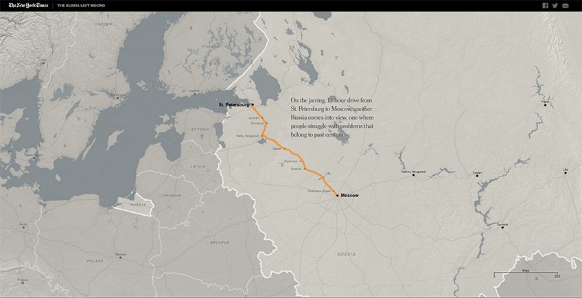
One great example of storytelling potential and multiple content forms is the NY Times news graphics. A special feature of this kind of content is convergence, which has turned a standard journalistic long-read article into an interactive reading experience. This is most visible in the text sections which are thematically separated through the context and story behind each place but together constitute the whole travelogue story. ‘The Russia Left Behind’ contains scalable vector graphics, which represent an interactive journey map from Moscow to St. Petersburg, between the places between two big cities.
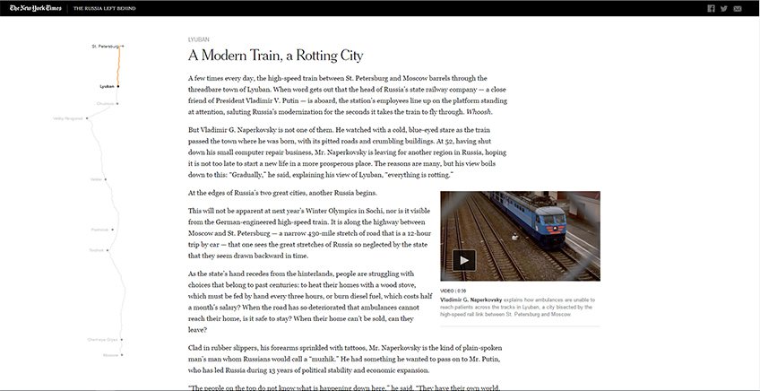
When the user scrolls through the article, an interactive map acts like a railway route through the visited places and helps the reader to follow the storyline. Every part of the story contains videos that visually complement the people and social environments of the journey. As the reader goes further away from the starting point, the story depicts more different individuals through their stories and everyday life. Visually appealing galleries with photos of the characters break up large paragraphs of text for an easier reading experience.
DESIGN
Design, as a micro-site component, includes aesthetic and editorial value. It additionally increases user experience. From the clear navigational structure, and highlights of the products all the way to detailed content. Try to focus your design efforts on specific content. Refine everything in order to give it high quality and meaningful significance. The balance between visual elements and content requires special attention. Try to avoid aggressive and conspicuous design which distracts from the main point or desired message.
For every designer, the devil is in the details. They have to be perfect in every possible way. From CTA buttons, and stylish graphics to aesthetically matched fonts. If your micro-site is commercially oriented, CTA buttons need to be visible, clear and screaming for attention.
Another important feature that can make a big difference is the level of user engagement. If the site has a sufficient dose of interactivity and interesting content, it’s more likely to capture visitors’ attention and raise their level of interest. In other words, users will consume all the content to a greater extent if it offers a higher level of involvement, not just browsing and scrolling. This is also known as the conversion rate or the percentage of visitors who take the desired action.
EXAMPLE: The Wolverine: Unleashed
Wolverine Unleashed micro-site was designed for commercial purposes of movie promotion. It is a representative example of the harmonization of content, design, and development. Integrated elements allow users to explore different parts of the Wolverine’s character, and encourage them to engage and consume the content.
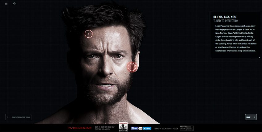
The most attractive element of this site is certainly the hero unit, containing initial instructions for content exploration and user actions. There are several animated interactive hotspots on Wolverine that represent parts of his body, specifications and relevant information about his special (superhuman) anatomy. Each of these points is accompanied by chunks of text, providing more information on a specific body area. Those hotspots are also items on the navigation menu so the site navigation is completely coordinated with the content.
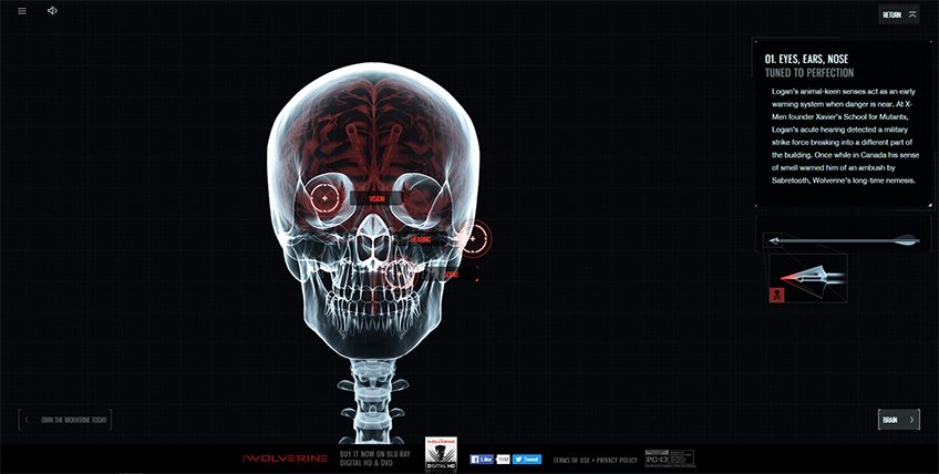
Visual feedback of user actions is highlighted with the animated parts of the body and internal organs. Interactive buttons placed on each side of the page footer, enable easier content consumption, and exploration of different body parts and specifications. Behind every hotspot, there is a video or photo gallery that tells a story about a particular body part or the way that it works.
DEVELOPMENT
Considering that content and design are inextricably linked the same goes for development. Each stage of the process and all the elements included must be aligned in a harmonious whole. Symbiosis in the DDC triangle is natural for this type of project, where multidisciplinarity is the main component for creating the top-performance micro-site.
There are several important frameworks of development that affect the performance and usability of the site. The management of interactivity and behavior of various elements (such as loaders, progress indicators, buttons, and sliders…) are the most notable aspects of front-end development.
Considering that the site can be designed in a highly interactive way, it is important to coordinate the loading of all elements to ensure a positive user experience and the natural flow of (their) actions. This includes a visually appealing pre-loader which must clearly indicate the loading status of the page, as well as a progress indicator that gives users feedback through the consumption of the site content.
Given that the background of the micro-site can be anything from canvas, video, image or scalable vector graphics, it is desirable that users, to some extent, have the ability to manage the content they want to consume. For that reason, there are clickable/tappable elements that indicate the possible action for the user to endure. Page navigation should be intuitive and natural for easy orientation and content consumption. This includes visual feedback of user actions and mouse events (like the scroll, click, mouse drag and mouse over).
Besides that, micro-sites have great potential in the context of gamification which can be used for a number of different purposes to engage or reward users. This type of content is probably the best way to reach users and arouse them to stay longer on the site. Most frequently this type of content are games, quizzes, interactive animations and other action events which are created according to the client’s needs.
EXAMPLE: The Boxtrolls
This microsite is based on multiple videos, combined with interactive HTML elements and integrated into the canvas tag which gives the overall gamified feel and provides a special content consumption experience. The whole page has an interactive nature and the main focus is placed on components that encourage users to engage and solve Boxtroll’s quest.
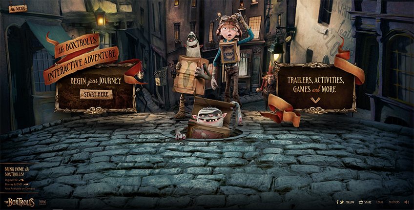
The homepage offers two possibilities – Boxtroll interactive adventure (based on the gamified content) and exploration of other interactive content connected with the movie. The game itself is a theme designed to promote the characters and plot of the movie. Each level of the game is associated with the background story that is told through the animations, characters and other visuals. The design is playful with lots of clickable options to explore.
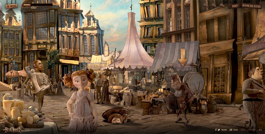
Page navigation is oriented mainly on the Boxtroll game quest, but the balance in content is achieved through other items in the menu. There are movie trailers and features, games and promotional offers which are visually integrated with the movie theme. This site is a good example of the diversity of content and gamification principle where the user is encouraged to consume the hidden content thus staying longer on the page.
Skilfull content creator always on the hunt for tech trends